Monday 30 April 2012

Vivid Please.

 ShopBlogTwitter


I was wandering through the Etsy Success forum the other day, when I came across a thread, searching
for people to participate in a feature swap. You can see the appeal: you both get some new exposure.
Well, I was game, so I had a look at their blog.

   Good gracious. It's not often you find blogs of such quality searching for people to participate in such things. Usually, the blogs in question have little design work, and little worth-while content, so I've never done them, but this time, well, I've had to add a new blog to my reading list. But it wasn't just that. I had a look in VividPlease's shop, too. Well, I had been in there before. I was looking for a gift for a friend and I came across their totebags - I never bought it, I ended up going in a different direction, but I still love the design. So when I found my virtual self standing in their virtual shop once again, I smiled to myself. I figured if I was fortunate to be picked for a feature swap, it would be win-win for  me. I get to pop up on a truly wonderful blog, and I get to feature a truly wonderful shop.
   It turned out that it was meant to be. I don't know how many of you post threads in the Teams, but you don't get notified of any new comments. To keep on top of it, you have to revisit the same thread and check manually. A few days passed since I left my offer, and I wouldn't usually have done it, I'd have normally just left it, but I sent them a quick message asking if they were still looking. A moment after I sent that message, a new one appeared in my mail box, from Vicky an David - Vivid (how clever!), and it was longer than it would have been if they had just replied to me.
   Well, long story short, Vicky and I ended up emailing eachother, and she's just fabulous. Her boyfriend, David, helps her to run the blog and the shop, and she's totally my kind of person - she's not afraid to be who she is, which makes a change these days.

   But onto my point. Their shop is wonderful. It's just full of so many cute things, from illustrations of their Scottish land of Edinburgh, to cute little strawberry brooches which are quickly growing on me...the brooches, not strawberries. That would be a delicious medical condition.

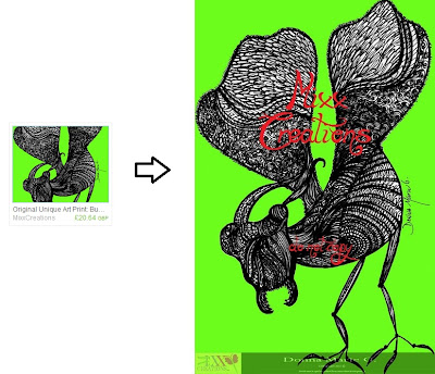
But let me show you...


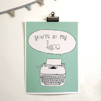
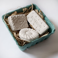
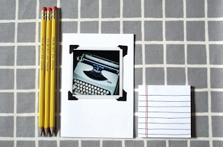
   Awesome, yes? I am in love with those biscuits. Proper biscuits. Bourbon! Custard Cream! Jam Ring! These are true biscuits, the best biscuits. And the only flaw with the plaster ones is just that: they are plaster. I can't eat them - though that's probably a good thing. I'm trying to slim down afterall. And their pencils are awesome too. I love custom engraved pencils. I tried to find a way to get them done myself for promo but I could never find anything that wouldn't cost me a month's carer's allowance. But look at that card--WAIT, no, look at these:


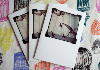
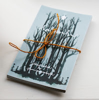
   Pterodactyls. You know I had to. But the best part - aside from the fact that the card itself is linen, my favourite card type second only to Kraft - is that those are actual polaroids, held in place with photo corner thingies. How great is that? I love it. Almost as much as I love those post-its.


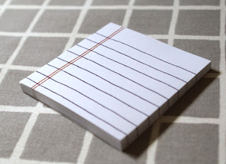
   I am a post-it fiend. If it's a funny shape, or has different colours/patterns/especially pictures, I must have them. These are sat in my Etsy cart right now, waiting for a little dosh to come my way. I can't honestly say I have need for them, since I work mostly on computers, but I have a ring binder upstairs falling apart with notes for my current trilogy, and I'm sure these post-its would look great stuck to paper scattered on the floor once it bursts. I must have them!

   After that brief jog through their wonderful shop, shall we have a chat?

Why did you start blogging? And why did you start Etsy?
We started blogging to document what we were up to. Places we had been, things we had seen and all the little things that we found inspiring but felt like they tend to get overlooked. It was like a little snap shot in our lives that we thought we should preserve. I would say that our blog started out to keep track of all the awesome things that we were experiencing so they would be remembered. I have a shocking memory, which is why I believe I got into photography, but when you shoot so much, your images inevitably get dumped on your computer to rarely be seen again. It's pretty sad! When you compile a journal, your naturally going to start putting pretty personal stuff in there too, so you probably wont share that either. But with a blog, you're telling the whole world what you think and what you've been up to! You're going to keep that PG cert :D hee hee!
As for our Etsy shop, it all started with a Penny Farthing bag. We had a lightbulb moment where making them was not an option and not sharing would be plain rude! Hee hee! We've found that we get complimented quite a lot on our eclectic style; people seem to like what we make and how we put it together so we decided that we should take the risk and put it out there. Etsy is a difficult market place as it is jam packed with good designers so you have to work hard at it. The more stuff you have in your etsy boutique the better, but not being able to be categorized in one box of what we do tends to mean we have to work harder. We love that our shop has a huge variety - it's like an Aladdin's cave of treats which is what we tend to be more drawn to, but it's a curse as much as it is a blessing. We're pretty flighty in what we want to do, we get ideas for everything, so sticking to just one category like stationery would kill us. We need a lot of distractions and spinning plates to keep entertained!

We know that "Vivid" is a combination of both of your names, but how did the two of you meet? And what sparked your collaboration?
We met whilst working in an advertising agency actually. We both have creative backgrounds, but I ended up working as an account handler and David worked in the creative department. Not long after I started I got given my first full client to work on, which happened to be a very creative business indeed, and we worked together on a big rebrand. It was the best project either of us worked on the whole time we were there! I think it worked so well because we were on the same level; David would be working on the brief's I'd written and he would basically create what I had in my head, only 100 times better! Pretty quickly we found that we worked amazingly together and naturally started hanging out and talking nonsense over coffee, which is when the Penny bag came about and when we started to work together out of the office in a more serious way.

Why do your cards only feature Polaroids?
My camera of choice is a Polaroid camera from the 1970s. When I started studying photography my professer saw the spark and lent me his one. He had a damn hard time of getting it back :D After a few months I bought my own and I've been using it ever since. I've had it since I was 18 and it is the one thing I couldn't live without. When Polaroid went under I went into a mad panic and spent a lot of my savings buying up all the film I could. It's still in my fridge as I only use it when I know there is going to be good light and an amazing event worth documenting on such precious film. You can now buy a new kind of film for them, which is good, but just not the same. I will be sad when my last packet goes, but I forsee I will be holding onto it for a very long time :) We've just created our first line of illustrated cards for the shop which funnily enough are based on a lot of things I would have shot using the polaroid camera! It's like an addiction. I think I need Polaroids Anonymous! :D

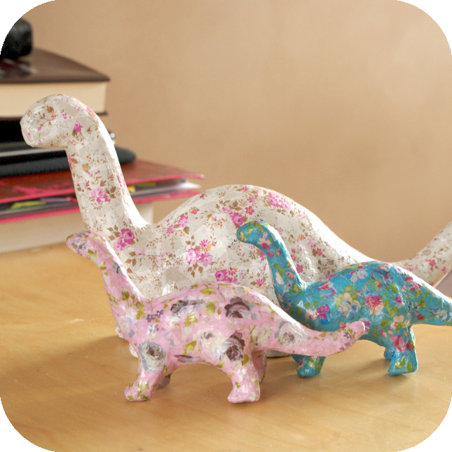
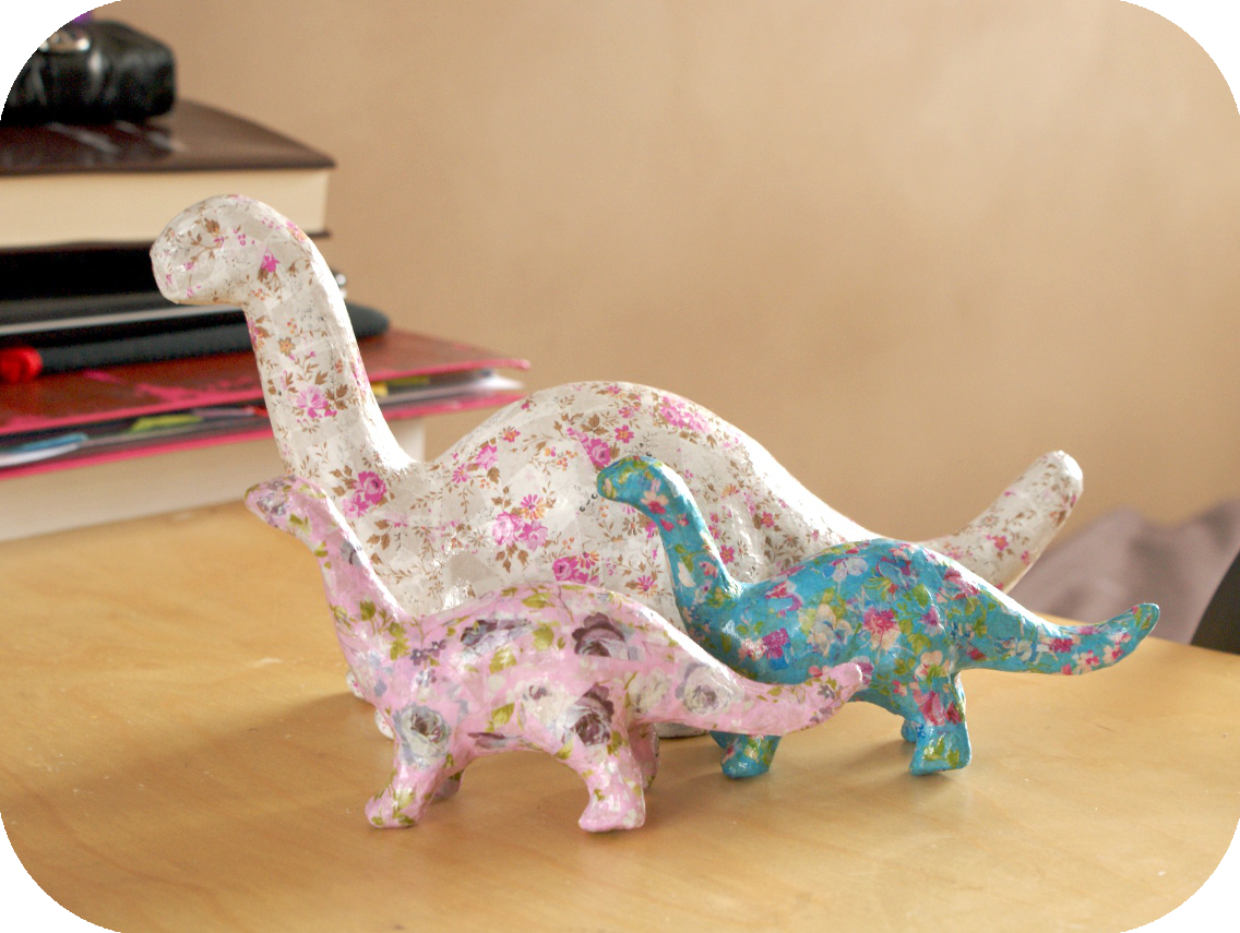
Which products do you enjoy making the most? And which products are your favourite? I can certainly understand that items that are the most fun to make may not be your favourite final piece! Those blasted dinosaurs!
We love making biscuits - both the real kind and the ornamental ones! It can get messy, but that's the best part of the day :) Making the cloud, strawberry and lemon felt brooches are a lot of fun too as you get to see their expressions come together slowly as you're making them. I would say the strawberry is our favorite to make as he has a cheeky smile and pips for his freckles... Who doesn't want to sit and work on that? It's hard to choose favorites, but if we could choose 3 it would be the biscuits, the let's grow old together bag and the make & do note pads. We'd have it all though!

How would you describe your shop?
Ahh, the ultimate question! We would love to hear how other people would describe our shop as we find it quite the challenge to sum it up in one coherent sentence! At the moment we describe our shop as Bags, Stationery. Prints & Accessories For Kitsch Geeks. We think that our stuff is aimed at the creatively curious, but many people look baffled with that description. We love a bit of retro, a twist of kitsch and a sprinkle of geek. Hipster is a word that seems to generate many discussions as hipsters don't like to be called hipsters, but we don't know how else to refer to them and get their attention without offending. Maybe it's because we're not hipster enough to be let in on the secret ;)

Ice cream or ice lolly?
Both! I'm an ice cream gal and he's a lolly guy :) It's great though because we buy a box that contains both and we don't have to fight over who gets what!

What do you do for fun?
We love a good car boot sale! A proper rummage in someone else's trash always provides quite the treasure whether it is a new trinket to add to one of our colossal collections or a good idea :) I also love to cook, not that I'm particularly good at it! I bought a book full of Elvis's favorite recipes when I went to Graceland so I've been trailing some of those recently too. We also love trashy tv. I think everything I learned in my youth can be traced back to Bill Cosby & The Huxtables ... so does David for that matter!

Where can we find you?
Mostly at Vivid HQ or in our favorite coffee place! But if you're not in Edinburgh, you can pop in and see what we're up to on our blog: www.vividplease.me we'd love to have you round for a cuppa! You can check out our little boutique at www.etsy.com/shop/Vividplease and you can find us tweeting away at http://twitter.com/vividplease. Oh, and we're on Pinterest too http://pinterest.com/vividplease We'd love to meet you :D

Anything else?
We'd love to hear how you would describe our shop!
We are also hosting a monthly giveaway so be sure to pop over to our blog and enter :D
Finally, thanks for having us round today, we've had an awesome time and we LOVE your stuff! 


How would you describe Vivid's shop? Personally I had tried to sum it up myself before, but the
way Vivid has described it themselves: " Prints & Accessories For Kitsch Geeks" - Kitsch Geeks
certainly fits! Have a wander over to their shop and see if you can find something to line their
pockets! I certainly can!


Friday 27 April 2012

Interview: Wandering Laur

 Shop  ♥  Facebook

   Meet Wandering Laur. Her jewellery consists of unloved vintage beads and old jewellery which has been rejuvinated with a more stylish touch, and look far better than the originals ever could have. Her shop has a gorgeous mix of pastel colours and darker, antiqued tones, and a large selection of each! I see many shops with similar jewellery, but something about this shop just makes it stand out to me.
   Seaglass is also becoming popular lately, and I've seen some fair pieces, but [name]'s take on it is a little more unique. She combines the soft, gentle tones of the washed up seaglass with far, far bolder paints, but only a small amount. The contrast between the two gives each end a great impact - the glass seems lighter, and the paint seems brighter. It's truly an original take, and I've seen no one else do it.


   I'm not usually fond of beads, or of necklaces which consist mostly of them, but some pieces in Wandering Laur really jump out at me! Like the pastel beaded necklace pictured below, and particularly the brown seaglass. The bronze paint still stands out but it has a calmer, if much more obvious look than the bright colours. But each piece in her shop really stands apart from the others, which makes browsing far more interesting - though can keep shopping difficult!


Let's meet Wandering Laur...

Your jewellery is unique and wonderful. Where do you get your inspiration?
Thanks! I get my inspiration from all over - the streets of New York City (where I live), the beach where I grew up, places I’ve traveled and people I’ve met, glimpses of nature, saturated color, and especially vintage jewelry. I also get a lot of inspiration from my materials themselves, since I use mostly antique beads, vintage chains, and found sea glass. It’s so much fun to take bits of vintage chains and antique unloved beads that I’ve discovered hidden away at an antique fair, and put them together in original ways. I love to create something a little nostalgic, with a modern twist.

Each of your pieces are quite unique from one another - some are pastel and others are far darker with antique and earthy colouring. Which do you personally prefer?
Sometimes it depends on my mood – I like the long, simple necklaces when I’m looking for something light and fun, but a most of the time my favorite pieces are the big jumbles, no matter what the color. And of course, I adore the seaglass. I try not to ever make anything I wouldn’t wear myself!

Your seaglass pieces are so unique! Where did you get the idea to add the bright paint?
The original ideal came when I saw someone wearing a piece of rough coral as a pendant. I got a flash of inspiration which just kept going – “that coral looks fun as a pendant, but it would feel rough against my neck and clothes. Wow, you know what would make an awesome necklace? Seaglass! You know what would make it even cooler? Painting it in fun colors!” From there I couldn’t get the idea out of my head and immediately set out figuring out how to make it a reality.

I grew up on the beach, in Rockaway Beach, New York, and my family has been collecting seaglass for years when we walk along the shore, even though we’ve never done anything with it. Now I’ve raided the jars we’ve been saving for an inspiration just like this, and put it to good use… I’ve never seen anything like my pendants, so it seems like I’ve created something pretty special. I’m really excited about them.


Do you have any plans for future pieces, or do you find your inspiration will only come to you when it wants to?
I’m always thinking of new ideas. Sometimes I have trouble falling asleep because visions of necklace ideas are dancing in my head – seriously! Just looking at my materials gives me lots of inspiration. The only thing stopping me from creating more is the amount of time in any given day. The act of creating is always pushing me in new directions with my jewelry-making, and that process of discovery is a lot of fun.

What made you initially join Etsy?
I’ve used Etsy for years as a shopper. When I started making jewelry, soon I had more than I could ever possibly wear. I was getting lots of compliments on it, so I thought, why not sell it? Etsy is so user-friendly and has such a wonderful community of sellers, it was a logical step.

When shopping on Etsy, is it mostly the jewellery sections you search, or do you find yourself frequently wandering into the paper goods or clothing sections?
I shop all over on Etsy! There are so many wonderful things out there – it never ceases to amaze me how incredibly creative people are. I got an iPhone charger that looks like an old book – it’s so much fun. I’ve even purchased some supplies from Etsy (a few great vintage chains). I’m definitely a browser. Just this week, I bought a beautiful laptop sleeve. I’ve also bought vintage – I got a great Coach purse from the 1980s last month.

What's your favourite item you've bought from Etsy?
It’s hard to choose – but I’ll say probably a bronze bracelet that looks like a raven’s claw that I’ve worn consistently for years and still adore. I also bought a Pendleton bag for my mother that she really likes, in lovely, natural colors.

Do you prefer tea or coffee?
Coffee! I live above an amazing coffee shop that makes the best latte in the world. I couldn’t live (or create) without it.


Project 52: Decopatched Dinos

   It's a simple Project 52 post this week. I was doing a lot last week, working on new jewellery pieces, doing this current project, and working on the gypsy caravan that I started even before all of that, and by Friday nothing was actually finished. I did write a post but then I forgot to take pictures of the pieces while they were in construction for it, so it never got posted.
   Well, as you may have seen, I completed the new jewellery pieces, and I completed my Decopatch, which is this week's project.


    I don't remember where I saw the products initially, and I'd usually have thought little of it. I recall, now I'm familiar with the product, seeing decopatch paper hanging up in Hobby Craft, and even then all I remember was pink leopard print, but I stumbled across the product again last month. It would never have grabbed my attention had I not seen vintage floral patterns and then a dinosaur. As you might know, I am slightly obessessed with dinosaurs. Some of you know this better than others. My boyfriend gave me mostly dinosaur stuff last Christmas (PlanetDinosaur DVD, Dinosaur cuddley toy, even dinosaur cake sprinkles!), I have lots of dinosaur documentaries - both fully CGI (like Walking with Dinosaurs) and others almost fully fossilised (When Dinosaurs Ruled - they got Jeff Goldblum to do the commentary purely because he was in Jurassic Park) - and a handful of real fossils, and a few fake ones claiming to be real. The real ones came from my boyfriend. The first thing he ever bought me was a dinosaur egg shell fragment, and then when he moved over here, he gave me a bunch of rocks with fossils in them - you can even see some of them in the group pictures on my dinosaur necklace listings. Those were all rocks he gave me <3

   I realise I'm losing my point. When I saw the apatosaurus model, unpainted/covered/decorated, and then I saw sheets of vintage floral papers, I knew it had to be done. But I didn't just buy one dinosaur. I bought three. One big apatosaurus (it's called small - it's like 25cm. Given what the product is, a simple paper mache model, that's pretty big!) and two extra small ones, about 15cm in length. They have extra large animals, but no dinosaurs. Just as well really. They measure at least a metre. That would be a lot of paper and a lot of glue.
   Well I placed my order and I bought some pretty vintage florals (and other pretties for other projects I might want to try), and it arrived the next day - I was pleasantly surprised (I would have been even happier, except the box came with packaging peanuts and I'm either very right or very wrong in thinking they're not recyclable or biodegradable, so I don't like to throw them out).
   Needless to say, I parked my mother in her wheelchair in the living room with me, stuck on Notting Hill - because hey, why not? - and began cutting and gluing, whilst explaining over and over again what was happening, reminding her who actors were and so on. It took me over a week to complete them, but like I said before, I was in the midst of other projects too, and now their finished (and have nowhere to live) I'm happy.

   I tell you, if I'd seen them on Etsy (regardless of how shoddy a job I did on the big one, but I still have a second sheet of that print, so I can go over it if need be) I'd be pining over them for so long, but I'd probably never buy them. But doing it this way, I probably saved money, and I had loads of fun doing it. And that's what really counts!
   I want to get some shelves up for pretty handmade things I've bought and made (yes, I've said this a lot lately, but given how hectic home can be, and that this is my parent's house and I'm likely to tear the wall down if I attempt to use a power drill, I need my dad to help me...and pay for it), and these will go up there, along with a few of Wonder Forest's fawns, Vivid Please's biscuits, and Constance Connie's fox paintings, of which I still need to buy spring's, and any other things which win their way into my heart.


   I'll explain the product. It's very simple. They're not selling an idea or anything, it's really only the paper. You can buy paper mache models to paint and cover anywhere (or use pretty much anything. I've seen chests of drawers covered in the paper, the same with bookcases - even a car!), the same as you could use mod podge if you already have it (though Decopatch's glue and sealant is a little thinner and dries faster). What they're really selling is the paper. Their patterns are limited, but there is a nice selection. They're cheap, at about 82p a sheet (40x30cm), their colours don't run or fade, and it's extremely thin, but sturdy. It's not like tissue paper, it has a slightly glossy finish, and won't at all threaten to rip when covered in glue. It's the perfect decopaging paper. But, of course, they draw you in with other aspects. The dinosaurs were what immediately won me over (next up are a family of stegosaurs!), and when I was placing my order, I bought lots of paper, some models, and a pot of glue/sealer. It was only after I received it I realised what the sealer was - but now I have lots of it. Mod Podge is my best friend when it comes to crafting (and glitter my worst enemy), so it never hurts to have more, or more like it.

   Basically, the product is great, and really fun to use. Just grab their paper, cut it into pieces, and paste it on. The idea isn't to have realistic detail on the finished pieces, it's more a case of patterns and giving a shape a colourful and fun look instead. I took art for A Level (there were 3 other people in my class, and in the year above me, the class consisted of one student. Yay for art!) but the word I'd use to describe the point is lost to me. Abstract? Who knows. Actually one of you probably knows. Help me out.
   I'm hoping to have a giveaway of a product pack soon, with a small pot of glue, a few sheets of the winner's choice, along with an extra small animal of the winner's choice (I won't force dinosaurs on you). But we'll see. My money is pretty tight to non-existant at the moment, so it may have to wait a few months.

   I usually like to let you all know what next week's project will be, (I seem to be loving brackets today) but in truth I've given up guessing. I complete what I complete when I complete it. I try to get one thing done a week but it's not always possible. Either my mother's condition temporarily worsens, or the xbox steals my time. So, we'll all see when the time comes.

Lataz!


Tuesday 24 April 2012

Etsy Favourite Feature

Oooh I've been so busy lately. I made a friend, too! I've also been making lots of new products
lately, if you hadn't noticed! Butterfly friendship necklaces, new dinosaurs and a bird house!
What fun. But for now, have a looky loo at what else I've found in my favourites!


All Over The Place

[Edit: due to the interest being expressed in this post, I'm looking further into making this bow.
Hopefully I'll have money for supplies soon and can get started ^^]

   Or, my mind is, at least. I've been busy doing unimportant things and neglecting what really counts. I'm trying to get back on track, though, and intend to start today. I made lots of new products lately, and I spent the entirety of yesterday either making scones, responding to a single email, or creating new listings. My writing has been neglected, despite the fact that I am at an exciting bit to write - not a boring explainy bit - but I intend to get back to it this evening. It doesn't help, though, that I've found so many spelling mistakes and stupid bits that make no sense in the actual book of the first novel, despite it being my sixth read-through. It's getting me down a bit, but I have to continue.

   But what is helping the least is the xbox. Seeg has been playing computer games lately, so the xbox has been free - needless to say I've glued myself to it whenever it's not been in use over the weekend. The problem is, that gives me a day-long distraction from doing things I have to do (and the worst thing happened: I was trying to get all of the achievements in Oblivion - I had one to go, to become the Duke of Dementia, so I made a save just before I had to choose between Dementia and Mania, and continued with my final game - keeping all the weapons and armour I loved - and when I was finished and moved all of my in-game belongings from the house in Anvil to Frostcrag Spire, I saved and loaded the other save so I could pick the other side and gain the achievement. Well, part way through the new save, I saved - y'know, in case a guard spotted me while sneaking - and it was all fine. I saved several times until I got confused, and saved over the original game. I've lost my favourite armour and the end of the game. Just as well I finished everything else or I think I'd have thrown another disk out of the window in a temper.)
   Well, I've finished with Oblivion (never did get that final achievement, I was too pissed), and moved onto Skyrim.
   There are lots of things I want to make and buy, some of which are ridiculous. I decided I wanted to buy a bow - a decorative one, not a functioning one, but all I can find are elven ones. As nice as elves can be, their bows are pretty dull. No, I had daedric bows in mind, but I could find nothing remotely similar.
   So then I decided to make one myself. Yes, I must be mad. The plan is to buy the upper and lower limbs of a recurve bow, a bow string, and cut some wood to make a riser appropriate to the design I want. Then, once that's fixed together, I will sculpt air-dry clay onto the limbs to make it look closer to what I want.


   This won't go well, but I figure I have little to lose in trying. It's the only way I'll get a bow that looks that spectacular. I already agreed with Seeg that I can make this if he can have some samurai swords. That was hardly a difficult decision on my part, but there we are. If and when I begin, you will all be sure to know.

   I don't have much to report, anyway. I've started a new exercise DVD, and I've bought another one on top of that. Fortunately, they're cheap as chips. I need a yoga mat, and I'm trying to get myself interested in salads again. It's difficult, though, to know what's healthy and what's not these days. Fat-free doesn't always mean it's the healthier option, and I'm not trying to just lose weight, I'm trying to get fit, too.

   Anyway, enough of that useless post. I apologise for a lack of a Project 52 post - the project wasn't finished. It is now, so I'll post it on Friday. As for my gypsy caravan, I ran out of PVA glue, and I tried to use flour, well, that didn't go well.

Over and out!


Sunday 22 April 2012

Etsy Seller Tips: Photographs (artwork)

   So you've sorted out your titles and your tags. Well done. Now you want to look at your photos. While titles and tags are straight forward for all art and product types, pictures are not. For small things you want to get up close with minimal distractions, which is easier in a smaller space, but for large items you want the same thing, which is harder when there's more room for something distracting to pop up. It's quite difficult to get it right, especially if you're selling larger things, since Etsy's full of little things and there's not as much space to find inspiration.
   Hopefully, this will help. Again, I thank all of my volunteers.

Covered in this post:
•Cropping thumbnails
•White backgrounds
•Photographing artwork - prints and 3D

   First we'll take a look at art. Now, there are different types, so I'm going to focus on art art for now - prints, paintings and photographs. 3D art will be visted later on.

   I'm going to use MixxCreations as my first example for Art. Art is a difficult one to photograph, especially if you're selling prints, because you likely have the digital version of the picture on your PC already, and it's mighty inviting to use that instead. The problem there is that you're not showing how the item actually prints; whether the colours are weaker in print than they are on the screen, or any texture the paper may have, or how it looks framed. It might seem silly to do to some people, but I'm far more drawn to prints if the picture shows the item itself, rather than the image.
   MixxCreations' work is hard to work with here, but I'll give it my best shot. Due to the artwork's unique nature, it's difficult to see by the thumbnail if it's been cropped in an awkward place or not, and thumbnails are extremely important. It's the first thing people will see of your listing. I was included in an Etsy Labs video one night, and they mentioned that my fabric spoons were cropped, as was my anniversary vial. They then went on to explain the difference between intentional and accidental cropping. The vial had been cropped while I was photographing it, so I was able to keep all the details I wanted without having to zoom out. This also meant that my thumbnail didn't suffer. My spoons, however, were photographed whole and cropped to a square, which meant the ends of the spoons disappeared in the thumbnail.
   Going back to MixxCreations, because the artwork is so unique and difficult to decipher at first glance, the cropping in this case doesn't cause too much damage. If anyone is interested in these specific pieces, they will click the item based on what they've already seen. But it is still a relevant point. In the case of the below image, it is set at about 570 x 888 pixels. This is quite long and narrow. Thumbnails are always slightly rectangular and landscape-orientated. Which means this:


   My paint skills are awesome. Basically what I'm trying to show you is that the image on the right is the image of the item you're buying (but in digital form) and the image on the left is all you see in the thumbnail. It may not be quite as damaging in this piece, but this is very relevant for jewellery and ornaments, and, well, everything else. The thumbnail is the first thing you see, and if too much is cropped off, it can be damaging and you can lose a lot of views that way, and people need to see the item if they're going to buy it. A way around this is to either decrease the length, or increase the width - again, in this case it's not so simple, but if it were a picture of the actual piece, there would be more room to crop and expand. I do it to several of my own pictures if they end up too narrow one way or the other.

   I can obviously see the appeal for using the picture itself in place of the picture of the product - it's clear, and all the detail of the picture is right ther, but it does pose several problems. In this case, someone could easily come along and steal the image and print it themselves in whatever size or style they want, which is why I added a "watermark" (read: scribble) to the larger image. But it also means that no one knows exactly what it is they'd be buying, and sometimes it can be an expensive guess.
   MixxCreations has one item in her shop that features the print framed, which is also something to look at.


   The problem here is what obviously makes using digital pictures more appealing. There is a slight reflection on the glass - though certainly nothing I immediately noticed - but the item is suffering from barrel distortion, probably because the photograph was taken too close for its size. The light isn't quite crisp enough and the wooden panel the picture is stood on takes away from the frame a little - and in this case, the frame comes with the print.
   Other than that, it's clear to see what it is that you're buying, and isn't a bad photograph. However, in the interest of comparison, I'll also show some images from another volunteer, WhitSpeaks. These pictures are, in my opinion, almost perfect. The pictures of canvasses are perhaps a little close, and the white's aren't quite crisp enough, but each image is clear and artistically and minimally displayed.


   Now onto 3D art. Things that don't go on walls. The products from PioneerArtisanworks are wonderful, but the photographs really let the items down. Wonderful metal flowers, they're certainly unique, but the photographs don't show the items that well for several reasons. I've chosen the Classic Red Rose as my example here.


   As you can see, all you're shown is the flower. I believe it does have a stem, and while all the available picture slots have been used to show tools and packaging, there are no secondary pictures of the product. On one hand, the flower is the most important part, but it's also nice to know if the stem has thorns, if it's perfectly straight or more naturally crooked, if it's thick or thin, and also nice to know how the bottom of the flower is shaped and if there's any sort of welding or wrapping marks.
   Secondly, the picture has a lot to be distracted by. I want to know what is in the background, whether or not it is a chair, but whether it is or not is not what I should be paying attention to. The black also compromises any romantic effect that the rose could have insinuated beyond the "red rose" factor, and just takes away from the product in general. I personally would photograph the rose stood in a vase or laying across a pale coloured piano, as suggested, but as it is, the picture could damage any sales.
   I used to photograph my pieces in my room on my bed cover. It never did me any favours, so I tried the white background. I know what you're thinking, but there is a good reason to use white backgrounds! They remove distractions, they keep the colours looking fresh and crisp, and when the thumbnail is viewed it's easier and quicker to distinguish what you're looking at.


To recap:
• White backgrounds remove anything that can distract the viewer and can make colours more crisp. It also makes it easier and quicker to distinguish the item in thumbnails.
• Thumbnails are cropped according to the dimensions of the cover image. The longer the image, the more likely the thumbnail is to be cropped and remove important features - you'd be surprised how important edges can be.
• Using all the available picture slots can help to show angles of items not visible in the cover image, as well as the work process and packaging.
• Don't take pictures too close to prints or canvasses or barrel distortion can occur. Try and take a step or two back and adjust the zoom as you'd like.


Disclaimer: All photos belong to the individuals mentioned and may not be used without their permission. I also cannot guarantee that you'll get a dramatic increase in views and sales by following these posts, they are merely advice and suggestions. If it doesn't work for you, it isn't my fault. Try other ways of making things work.


Thursday 19 April 2012

Etsy Seller Tips: Titles and Tagging

   Let's start at the beginning. You're looking to sell your wonderful handmade pieces on Etsy. You've seen other people sell beautiful things - maybe even pieces similar to yours - and they've had hundreds of sales, and haven't even been open that long! It seems impossible, then, that your items won't sell during your first week. Your head fills with the ideas of a plumper bank account, an Etsy shop bursting at the virtual seams with products, and messages every day with praise and custom requests.

   A couple of months on, you've made only a handful of sales, and you're beginning to give up, or perhaps you're still planning on starting but don't know where to begin. Hopefully, this series of posts will be able to help, whatever stage you're at!

   So let's get on with it: first thing is first. I always recommend that you think like a buyer. You might have the perfect words to describe your items, but will people honestly search all of those words? The latin name for a plant may not do as well as the common name - which would you be more likely to search? "Bellis Perennis" or "Daisy"? Assuming that you're not some botanical wizz, you're more likely to search "daisy", regardless of the numerous types of daisies there are. This means that, while "bellis perennis" could be suitable in the tags, it has no business being in at least the first half of your title.
   Etsy works with relevancy now, instead of recency. It's been this way for a few months now, and I think people are getting the hang of it, but I still see silly mistakes being made.

 Covered in this Post:
• Titles & Relevancy
• Rearranging words
• Tags - words and phrases

   Let's look at an example. For this part, I'd like to thank ONARDs for volunteering their items. Their products are beautiful, and though the photos are a little over exposed (too much white, edges are hard to make out), I can see nothing else wrong with them.
   The problem here is with the titles and tags. The first three or four words of the titles are the most important. In the case of ONARDs' wonderful item, the blue starfish teabag holder, the first four words are "Ocean Blue Starfish - OOAK" - if someone's making a treasury of oceanic critters then this will be a great catch (hehe!), but if someone is looking to buy a teabag holder, they won't find this piece without difficulty. The same goes for the "Apples in the Basket" iphone case, and the Ganggangsullae Original Hand Painted" plate.

   So let's pick one to aid then, shall we? Eenie Meanie Minie Mo..."Apples in the Basket" it is. I love it when sellers name their products - sometimes dolls will be given full names, other times a simple necklace will be given extra charm with a unique name like "Charlotte" or something more whimsical. And from time to time I do like to search my name to see what comes up (never anything too awesome), but no one is really going to search a name when looking for something. If someone wants something personalised, the word "personalised" is more likely to be used. But let's stick to the matter!


    "Apples in the Basket" is great - really cute - but it won't be found if someone is searching an iphone case. Instead, the word "iphone" is the ninth word in the title. Descriptive words are always useful, but the most relevant word - plate, dish, iphone case etc - needs to be in the first three or four words. Ideally, I'd change this title's first four words to "Apple Basket iphone cover" and then add details like the swarovski crystals later in the title. There's no need to remove detail, it's just a case really of moving words around. If you've named your piece - like Apples in the Basket - then this can still be kept in the title for easier identification of the design, should someone wish for this design on another piece, but it's better off at the end. "Ocean Blue Starfish - OOAK" would turn to "Starfish Teabag Holder" and then add "blue" "ocean" "polymer" and the like afterwards. Relevant words like the colour or a certain feature should be kept in the first four words too, as long as it's the largest part. That's why the teabag holder remains a starfish, the iphone case remains an apple basket, and the plate remains a ganggangsullae (painted plate ganggangsullae dance)


   Another example is that of Lumm. Love the name, makes me think of Rayman. Her items are lovely, but she could benefit from better photographs as well as better titles - but a future post will look at photos.
   Her titles are similar in that they can be improved and that occasionally there is a name that won't be searched, like "Sunrays in the Scarf" which unfortunately also covers the entire first four words. As above, the word "scarf" should be one of the first, and, in this case, the colour and method (yellow/green/crochet) alongside it.
   But a mistake I've seen time and time again in both titles and tags is that of including the word "handmade" or any variation thereof. There is no need at all to include such a thing. If it's on Etsy and it is in neither the vintage or the supplies section, it's generally expected to be handmade.

   The piece titled "Handmade Dainty Copper Large" Earrings is one that I've picked to look at more closely for both titles and tags.


    The title, first of all, needs to drop "handmade" altogether. It's a complete waste of characters. Otherwise, all I can really see is that it is a normal case of rearranging words. "Earrings" is the fifth word - and the most important. The second most important word, in this case, is "black" and "lace", which are the seventh and eighth words. I'd rearrange this title to "Black Lace Earrings OOAK" and then go on to add the copper and the dainty - I do believe that dainty could be important in these cases.
   Titles are easy enough to fix. But tags are not. They can take a lot of time and can be a real pain. I hate doing them. Especially when I'm eager to get a new listing up but I'm not in the frame of mind to think very well. But nooo I can't wait, so I go ahead and fill in any old rubbish, and I think it's the same for a lot of people (not in this case, though, don't worry Annika).

     Instead, though, in this case, key words have been replaced with terms. The first three tags in this case have been added by Etsy, and I'm really pleased to see she didn't fall victim to something that a lot of people do. When you select the section in Etsy where your item will be listed, it's added as a tag. In this case, she added it to Jewelry, Earrings, and Fiber, meaning she didn't (and hasn't) need to add those herself. A lot of people do it - I used to do it - but I had a look at my own tags one day only to find that "necklace" and "jewelry" were added twice. So well done Annika for not falling to that one.
   However, tags are supposed to be words that are relevant to the listing that are most likely to be searched. This is where sellers really need to think like buyers, but where they're least likely to. In this case she's tried to add too much info. You are limited to thirteen tags on Etsy, and you really must use them well. Each word has to be able to be searched on its own, and any phrase has to be carefully picked so that it's likely to be searched, too. "light small feminine" will not be searched. People are more likely to search those words individually, but because she's added them all into one tag, she's quite likely to be missed out of the search results. The same goes for "wide crystal lace", "unique new bold" and just about every single tag she has.
   It might seem like a good idea to add more detail to tags like this, but it does far more damage. Instead, these keywords have become keyphrases, that will not work unless used exactly as they've been shown above. You have to choose your tags wisely. For this particular listing I'd suggest "black lace", "boho" "copper" "black" (I do believe sometimes it's a good idea to separate phrases into individual tags as well, but only if you're having trouble filling spaces, which can be the case with very simple items) "dainty" etc. And as for "women girl her small" - you don't generally need to specify that such jewellery is for women. The only time a gender really needs to be mentioned is if it is specifically for men.

   Tags are tricky, titles not so much, but that doesn't ever mean that it doesn't go by missed. Some titles I see consist of only three words - and sometimes those sellers can have thousands of sales. I bought from one only recently. But that doesn't mean you should follow them. My titles used to consist of about three words, but when I worked on my tags and titles in this manner, my views went up considerably.


   Thank you to Lumm and ONARDs for volunteering for this post. Other posts with other volunteers will be up soon, including photography help, descriptions and help for once you finally make that first sale.


Disclaimer: all photos belong to the users mentioned and may not be copied without their consent. I also cannot guarantee that by following these tips that your views will rise tenfold, these are merely guidelines and suggestions to help you further yourself. So it isn't my fault if it just doesn't work for you.


Tuesday 17 April 2012

Etsy Favourite Feature

Time for another Etsy feature. I'll admit to having neglected the blog a little bit lately. I've
been obsessed with working on new tutorials (and playing Oblivion) that it's been momentarily
put on the back burner, but I have some plans for upcoming blog and Etsy tips posts, for some
new tutorials, and hopefully a few features and a giveaway, though I'm not sure about that last
one yet. So for now, enjoy the ever flowing Etsy favourite feature!


Saturday 14 April 2012

Project 52: Sailing Ship

   Well, I finally did it. It took me a whole week and then another week just to post it, but I finished it ^^ The post is also a little late, but we won't worry about that :P At least I got it up.
   I love sailing ships, I do. I don't know why. They're charming and exciting, but I will admit to not being too keen to ever really get on one. I get seasick. But the sight of one from solid, dry land is quite spectacular. Perhaps it's because I come from Bristol, who knows?
   Anyway, this week's Project 52 is the frequently-mentioned "ship project". I haven't used paper mache for years, not since primary school, and to be honest I'm sure I was doing it wrong. But I went ahead with it anyway. I'm a huge procrastinator - as some of you may well know by now - and I'll look for any excuse to put things off - especially if they're important or exciting. There's a project regarding maps that I've wanted to do for some time, but I haven't because I'm not confident enough to try it (though it's only really painting). I know that I'm being silly about it, and I will definitely do it some time soon, just likely not yet.
   This, however, I did do ^^ And I'll talk you all through the steps should anyone feel compelled tojoin me in my shipiness. I have plans for another old fashioned vehicle favourite of mine which I actually will get on with quite soon. But for now, we'll just focus on this ^^
And it's a long one.


You will need:
About 3 sheets of A4 (standard) card
PVA glue
A bowl
Paper strips (I cut up book pages to give it that something extra)
Sticks
Fabric
Thread
Wire
Tape
Hot glue gun


Method:
1. First of all, choose a ship body. I used the Half Moon, a Dutch ship used by the East India Company, but the masts don't match. I chose it for its shape. Draw the side of the ship on one sheet of card. You don't need detail, just the outline will do. Mine stretched the length of the card but it wasn't very high. In fact it looked a bit too low, so I drew it out again and it ended up looking exactly the same, so I went ahead with it anyway. I figured I'd rather it looked right and be low than look wrong and be higher. It turned out perfectly in the end anyway. Also, my ship was flat-bottomed which meant I was able to use the bottom of the cardboard as the bottom of the ship. If you go with a typically rounded hull, then you'll want to draw it in the middle.

2. Once you've got your outline, cut it out. Lay it on top of the second piece of card (unless you used up less than half of the width (portrait ways) in which case just flip the card over) and draw around it. Cut it out again. Don't worry if you've drawn the two outlines facing the same way. I panicked momentarily and realized that I could just flip the card over when I was done and the problem would be solved. I am a little slow at times.

3. Tape the very front of the bow of the boat of each pieces together. The tape does not have to be tidy - this entire thing will be covered in paper mache in the end anyway.

4. Once you've done that, cut a strip of card. It should be the width that you want the ship to be at the widest point, so take your ship as it is at the moment and bend the sides slightly to how you want it to be when finished. Grab a pencil and (try to) mark parallel lines for that. The middle of the ship in my case is wider than the bottom of the stern, so I made a second set of markings for the width of the stern. Cut the card along the widest lines. The image below shows mine once cut with the stern placed at its markings.

5. Now comes a tricky bit. The stern of my boat is a bit strange. In most cases the stern would probably be quite smooth and curved, but the Half Moon has two flat, straight surfaces, and one slanted. This caused me a problem. I taped the top surface to the end of the strip of card (at the widest cut because the top of my stern is wider than the bottom), and then I had to fold/score the card to the side of the ship's specifications. I managed it, but it wasn't easy, especially since the tape didn't want to take to the card I was using, but I had to struggle with it. Do what you need to do.

6. I had to cut diagonally (thank you Harry Potter) through the strip of paper from the widest markings to the narrower, but when I had done that I taped the edges down. That still left me with excess bits of card around the hull, but we haven't gotten that far yet. Focus on the stern first.

7. Now we've gotten that far. Spread the hull of the ship to the curved shape you want and (again, try to) mark on the bottom card the rough shape you want, then cut those lines and tape it to the body of the ship. It doesn't matter if it doesn't quite line up because you cut too much off, the paper mache will hide and strengthen these parts anyway. (the picture at this step shows a strange strip of card inside the ship - this was there because the tape wouldn't hold properly and I wanted to make sure the shape stayed when I started mache-ing.

8. Now comes the long, fun and messy part. The paper mache. Mix up your glue in the bowl. one part water and two parts glue. You don't need too much - if you make too little you can always make more, and, for me at least, it was still usable the next day, so it doesn't have to be done in one sitting, and, in fact, shouldn't. On the third day I did need to add a little more water to it, though.
   Grab your strips of paper and run them through the mixture. Remember that the wetter the paper, the longer it will take to dry, and the more you risk a wrinkle in the finished piece. I have a few, unfortunately, but I'll get over it.
   Give it one full layer, inside and out, then when that's dry, do it again. Give it as many layers as is necessary. This is the longest part of the project, but the easiest. If any paper strips end up folding over the cardboard in a way that there is excess on the edges, they can be trimmed off later. Let the paper dry before adding another layer. Or, alternatively, wait until it's almost dry like I did, and, again, risk wrinkles.

9. Put the boat to one side. You could get on with this part while the boat is drying, which I did not think of. Take your sticks and cut them to the desired height. It's a good idea to stand them in the boat to get an idea of the height you'll want, though I guess I should have said that earlier, before your boat was soaking wet and stood upside down on the edge of your table. My bad!
   Take the sticks, and wrap paper around them, or paint them, or leave them as they are, it's your call. I stole these sticks from some orchids that don't seem to want to grow. These sticks will make the masts. The longest of mine is about 40cm, I think. Cut the length of the masts, decorate them as you wish, then cut shorter pieces for the horizontal/diagonal beams which the sails are mounted on. Position them on the masts to get a better idea of their length if you need to. Decorate these in the same way, then take your hot glue gun and fix them to the vertical masts. I ended up removing mine several times because they just weren't straigh enough. They looked it from the back, but not from the front.

10. Take the fabric you've chosen for your sails. This fabric is really what makes the boats unique. I used plain canvas that I've bought for the previously mentioned map project, and I know that I'll have a lot spare so it was fine for me to cut in, but using vintage fabrics from Etsy or your local craft shop could make it look just gorgeous. I love ships too much to do that, but I may make another in the future and do this with it.
   Lay the fabric out flat and place the masts on it. Mark the edges of the beam that the sail will be mounted on, then mark another two corners further down at a wider width - I think the shape is a trapezium? I was never good at maths. Or English, it seems, because instead of "good" I wrote "goot". Make sure that the sails are longer than your sail will be when it's fixed into place, then cut it out.

11. If you're worried about the fabric fraying you can seal the edges. I think it can be done with a match or something but I know nothing about this, and I would never recommend it unless you know what you're doing. I used a thin layer of Mod Podge on the back and it seems to do the job, especially since this isn't a toy, it's an ornament.

12. Fix your sail to the mast. I just loop stitched my way, since I cannot sew to save my life. Once that was done I used more Mod Podge to fix the thread to the beam (wrote bean) and keep it from sliding around.

13. Now you have several options. You could take some thread and stich it to the bottom corners, then link it to the mast behind it, halfway between the bottom of the sail and the top, or you could fix some wire to the back of the sail along all three edges, bending the two sides to the same circular degree and using the bottom wire to basically keep it on one side of the mast, or you could do what I did which was probably the most complicated. It depends on the thickness of your fabric really.
   I cut some wire about the length of the two sides, cut a small hole in the bottom corners and looped the end of the wire through. I then took the other end of the wire and tightly wrapped it around the mast at the same point I would have if it had been the threaded method mentioned above. The two corners should be pulled back, this way. I then bent the wire until I was happy with the way the front looked. I'm not that happy with the sales, I realise now the mistake I made: they should have been even longer. The curve of the sale to imitate wind isn't enough, as far as I look at it. I did remove one sail because it wasn't wide enough, so they can be cut off at the stitching if you want to make yours look better or correct any similar mistake, even if you have Podge'd it.

14. Now I assume that your ship is dry. I'm writing this tutorial based on the crooked way I like to do things. Like how I let my ship dry and did nothing but watch Skyrim, rather than work on the masts, then finally worked on my masts and did nothing with my perfectly dry ship, I now decided that, with my masts ready to be fixed to the inside of the boat, now was the perfect time to give it a thin layer of paint and make things ungluable for a further day! Yay!
   I mixed up a bit of white acrylic paint with lots of water and gave the boat three coats (drying between each, of course) of paint. This reduced the harshness of the print of the pages, and gave it a slightly shabby look, which I was fond of.

15. Fortunately, while this was drying, I was smart enough to think of something else that needed doing (it had to happen eventually). I needed to fix some way of hanging it up to the masts. I decided on the masts before, but you could put it anywhere if you wanted - two at the bow and two at the stern, I suppose? Either way, I grabbed some wire and made a nice big loop, then generously hotglued it to the top of the two highest masts. Now, you could just use the highest, middle mast, but you'll have to position everything just right. It's not easy. It's the hardest part, actually.

16. Do this hardest part. Position the masts and hot glue them down. Be generous with the glue on the mast that it will be hung by. If you're hanging it by the hull then it won't matter, but don't be too stingey or they'll fall down in the end.

17. Thread some string through the loop and hang it up. You're done. I want to get some nice (fake) flowers to go in it and hang over the side. It'll be hard to find the right ones and find how to manipulate them enough to get them how I want them to look but it would look gorgeous when finished. If you're willing to do the work on the hull and the masts, you could fix it so that it could take real plants - even be a hanging planter! That would be awesome!


   You could always add extra details to the ship. Give it thicker paint and paint it to look like a real ship, maybe even add much more paper mache and give it some more shape - a bust at the front, even!
   I want to get some appropriate thin roping to add some ropework to the sides of the boat, but it'll have to wait until I find some idea of what keywords to use to search with. "String" and "mini rope" won't quite cut it.
   You could hang things from it, little clouds or something and make it look really dreamy, maybe even wrap some small LED lights around the masts and edge of the boat. There's plenty you could do.
   And plenty of ships, from galleons and frigates to small sailing boats and even little fishing boats with no sails at all. I might give that a go and hang it from the hull.

   Hopefully next week I'll have a similar project on an old land-based vehicle, but I don't know if it will be done in time. We'll have to see.